

Same Same but Different
How to make sure your work doesn't pass people by

Twenty five years ago I found myself in Thailand. And when I say ‘found myself’ I don’t mean ‘discovered a deep well of inner meaning’. Rather I ended up there having secured a knockdown plane ticket from Manchester Airport. Anyway, one of the many things that struck me as I wandered dazed round the streets of Bangkok was the use of a phrase I’d never head before: ‘Same same but different’. Employed in all kinds of contexts it meant that this foodstuff, Buddhist temple, hotel room or tie-died T shirt was exactly like another, except insofar as it wasn’t.
‘Same same but different’ quickly became part of my traveller’s patois. It was both amusing and convenient - a happy combination of attributes - but I’ve not had much cause to fall back on it in the intervening quarter century. At least not until recently, when it struck me that it might be a very elegant way of encapsulating the reason why great creative work really works, and why most creative work fails.
To explain why, I’d like to begin with an observation by the French blogger Christophe Courtois. Christophe was struck by the way certain genres of movie are often advertised with strikingly similar posters. I’ve included some of his montages in the carousel below.


Action movie posters are often monochrome but with a flash of flame and the lead actor depicted in a dynamic pose. Thrillers and horror films often fall back on the trope of female lips in close-up; sometimes with the provocative addition of a trickle of blood. Love stories offer up two large floating heads above a serene or sometimes storm-tossed sea. And we know it’s a rom-com if we see a man and a woman back to back against a plain background.
Now you could make the case that the movie marketeers are using semiotics to let audiences know what kind of film to expect. As twenty-first century citizens we’re able to decode these simple signifiers without even being consciously aware that we’re doing so. However, I’d argue that this trick of communication, this use of visual shorthand, comes at a cost, and a very significant one: effectiveness. To explain why we need to understand a bit more about how our brains make sense of the world.
There’s a wonderful book by acclaimed neuro-scientist Dr Lisa Feldman Barret: Seven and a Half Lessons About the Brain. Unlike many books about neuroscience it’s short and readable. In it Barret makes a surprising revelation: the principle function of our brains is not thinking - despite what most of us would, erm, think. Its role is more important than that. The brain has evolved to enable us to pass on our genes with the minimum calorific cost possible. It’s an energy saving device.
What this means in practice is that your brain is constantly making predictions about the world around you; it’s always one step ahead of the game. And so long as the world conforms to expectations then you pootle along in autopilot, without expending unnecessary energy. Occasionally though, something unpredictable will happen - reality doesn’t conform to the what the brain anticipates - and BOOM! Your circuits light up. You’re on alert. You’re primed to take action. This instinct served our ancestors well. It mean that on a tedious walk across the savannah, the instant a lion’s face appeared in the long grass they’d be ready to fight or - more likely if they were my ancestors - take flight.
In the context of twenty first century communications this neuroscientific insight goes a long way to explaining why so much creative work fails. Most commercials, TV shows, movies, songs and books look, sound and feel like most other commercials, TV shows, movies, songs and books. There’s a formula and people follow it (as Christophe Courtois has ably demonstrated). And so most of the time these cultural artefacts make very little impact upon us. Sure, we might have a passing enjoyment of them as they sail by, but they’re unlikely to make any kind of lasting dent in our consciousness. Our brain tells us, ‘All is as it should be, move along.’ But now and again, like a lion leaping from cover, a work comes along that breaks free of the formula. There’s a twist, an unexpected image, an eccentric key change, a break in convention, and our brains kick into gear.
Dr Karen Nelson-Field has written about this in her book, The Attention Economy: ‘If you ever want to truly and completely grab an individual’s attention then you must break their prediction. When a prediction fails, the brain becomes primed to take in and hold onto new information.’ All of a sudden we’re listening and watching and engaging in just the way that a creator of a work would want us to.
Now we shouldn’t get too carried away here. Run with this logic and you might assume that a surefire way to guarantee creative success is to make a work so outlandish, unconventional and genre-busting that people’s neural circuits go wild. Indeed that is what might happen, just not in a good way; if something is too different people can’t get their heads round it.
When Picasso began Les Demoiselles d’Avignon - his first foray into the style that would become known as cubism - the reaction of his friends and peers was so disappointing that he put it aside for several months. Matisse called the painting a bad joke. Having eventually completed the work in secret, Picasso tried to sell it to his most loyal patron, who laughed in his face. The artist was to wait another nine years before daring to show the work in public. And would have to wait even longer before it became widely acclaimed as one of the landmark works of twentieth-century art.
James Joyce had similar trouble with Ulysses. A book considered so iconoclastic that it was banned in the UK and burned in the US. When Stravinsky premiered his avant-garde composition The Rite of Spring in Paris, the audience was so affronted that they ripped up their seats and began a riot. And in a gesture less dramatic, but still as damning, the 1956 edition of The Encyclopaedia Britannica lambasted the new musical form of rock and roll as ‘insistent savagery, deliberately competing with the ideas of the jungle.’
So if abiding by convention leads you to lose your audience, but transgressing convention also has the same effect, what are you to do? Is there a middle way?
Well, yes there is.
The path of optimal difference.
Optimal difference is the sweet spot where a work feels just conventional enough for an audience to be able to contextualise and make sense of it, yet different enough to feel new and surprising - to give you that cognitive jolt that makes you switch on and take notice. Think of a TV show, movie or novel that’s made a particular impression on you recently and almost certainly you’ll be able to identify something unexpected in the way it was plotted, or the characters were depicted or the way it was shot that gave it that little extra something.
Recently we’ve all been talking about Adolescence. At face value it’s an episodic crime drama, a format we know well. The subject it deals with - a child who’s committed a grievous crime - while not common isn’t unfamiliar and has been told in other books, films and series. But to tell the story purely from the point of view of the family of the murderer, to do so in one shot, and to establish guilt from the very first episode without ever straying into a courtroom scene, these are all things that make the familiar unfamiliar, and are the reasons the show has made such an impact on so many of us.
You see the principle of optimal difference at play in advertising too. Take this powerful campaign from the British Heart Foundation which ran a couple of years ago during the Euros, with the aim of raising awareness of heart disease in young people.
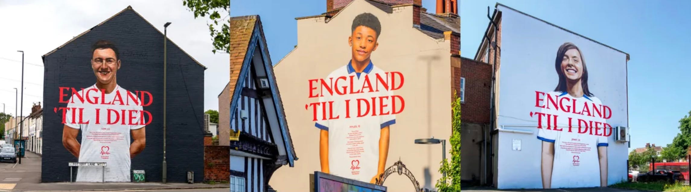
We’re used to seeing murals of football players on the gable ends of terraced houses in cities across the UK. But here there’s a twist: these aren’t soccer stars, they’re regular people. So we’re already nudged out of autopilot. Then there’s the copy - a twist on the England chant ‘I’m England Till I Die’. With the addition of that extra ‘d’ to put the verb in the past tense, the line acquires a new poignancy, especially in the context of the smiling face above. The familiar made unfamiliar.
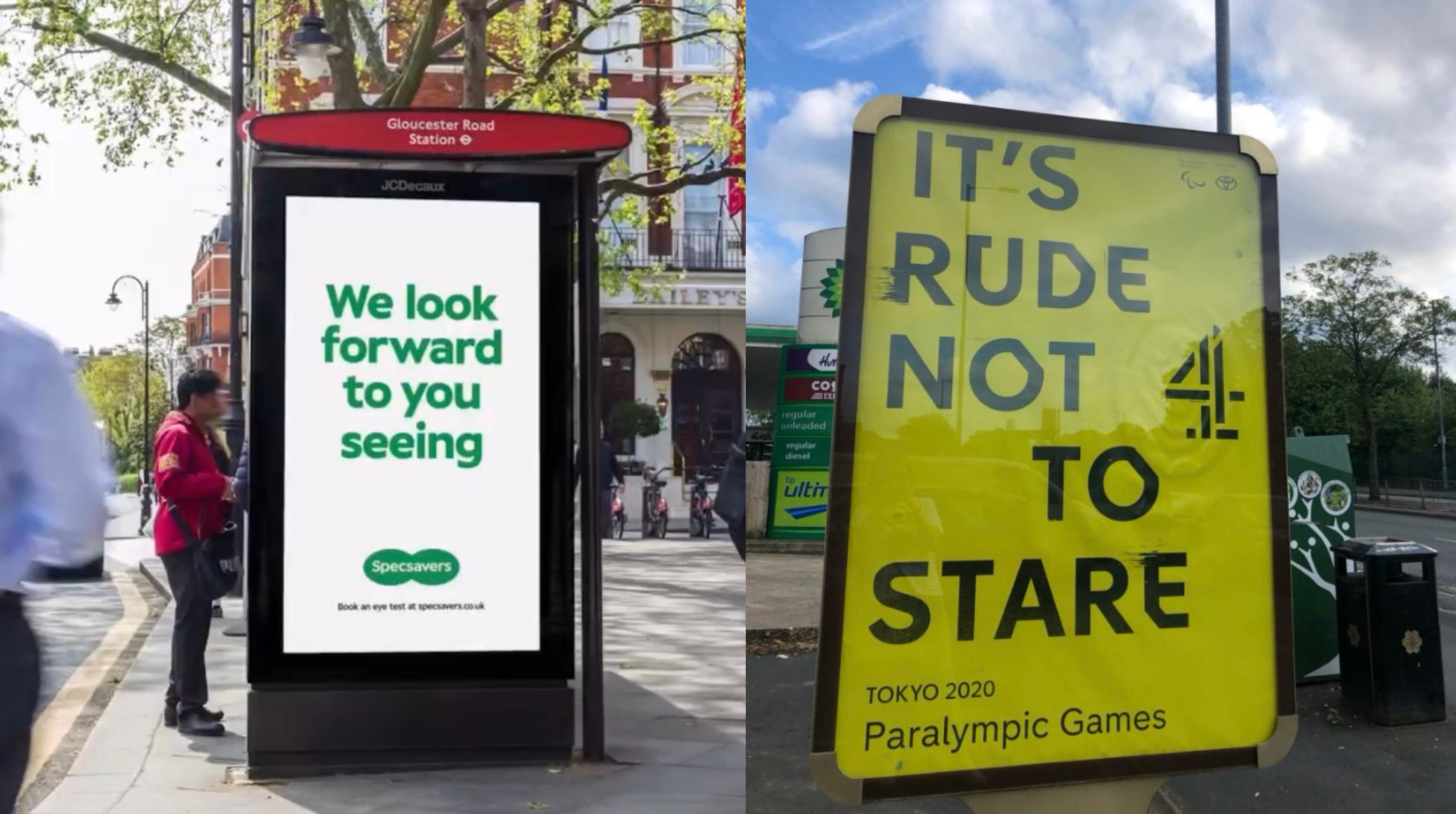
Or these two ads. One from Specsavers, the other Channel 4. Both use a kind of syntactic surprise; first to make you stop and take notice and then to engage your grey matter to decode the intended meaning. Here optimal difference makes you a participant in a way you just aren’t in 99.9% of other commercial messages.
The conventional has a tug, a gravitational pull. It feels comfortable because it’s familiar. But as an artist or creator the challenge is always to go one step further. Because it is only when you break with the familiar that your audience becomes fully engaged. It’s a strategy that works on a micro level in the execution of a piece; when I’m writing I’m always in a battle with the easy turn of phrase that feels right because I’ve read it many times before but I know will turn my writing into word wallpaper. And it works on a conceptual level too; using a format that your audience already knows but then twisting their expectations and taking them to a place they couldn’t have imagined you’d go.
It's a question to keep in mind next time you’re making a piece of creative work. Can you hit the point of optimal difference? Can you be same same but different?